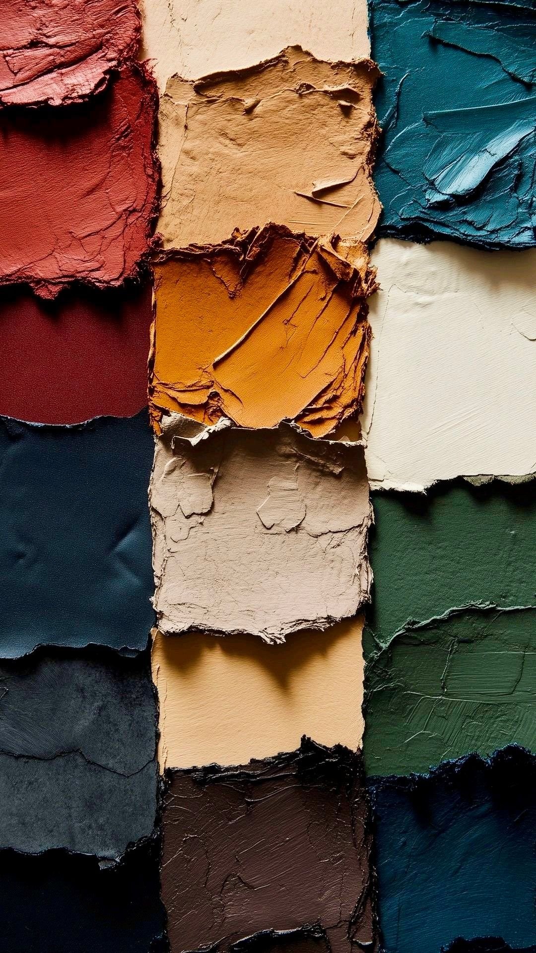
Colors in Interior Design: How to Create a Balanced Color Palette
Color can completely change how an interior space is perceived. Learn the basics of color selection, warm and cool colors, the 60-30-10 guideline, and how lighting and materials influence the final result.
Color is one of the most influential elements in interior design. It can make a room appear brighter, calmer, warmer or more visually dynamic, while also helping connect walls, furniture, flooring, fabrics and decorative elements into one coherent composition.
Choosing colors successfully, however, is not simply about selecting a favorite shade. The designer must consider the relationship between color, lighting, materials, proportions and the intended character of the space.
Understanding the Color Wheel
The color wheel is a useful starting point for understanding relationships between colors.
Three basic categories are:
Primary colors: red, yellow and blue
Secondary colors: orange, green and violet
Intermediate colors: created by mixing primary and secondary colors
Designers can use these relationships to create different color schemes, including monochromatic, analogous and complementary palettes.
Warm and Cool Colors
Colors are often described as warm or cool.
Warm colors, such as red, orange and yellow, can introduce energy and visual warmth into a space.
Cool colors, including blue, green and violet, are commonly associated with calmer and visually cooler environments.
However, this distinction is not absolute. A particular green, gray or white can have either warm or cool undertones depending on its composition.
Neutral Colors
Neutral colors play an important role in contemporary interior design.
Common examples include:
White
Off-white
Beige
Gray
Taupe
Brown
Neutral interiors do not necessarily have to look plain. Designers can create depth by combining different tones, natural materials and textures such as wood, stone, fabrics and metal.
The 60-30-10 Guideline
A commonly used interior design guideline is the 60-30-10 rule.
The idea is to distribute colors approximately as:
60% – Dominant color
Usually applied to large visual areas such as walls and major surfaces.30% – Secondary color
Often introduced through furniture, curtains, rugs or other significant elements.10% – Accent color
Used for smaller details such as cushions, artwork and accessories.This is a design guideline rather than a strict technical rule. Depending on the concept, designers may deliberately use different proportions.
Lighting Changes Color
One of the most important considerations when choosing a color is lighting.
Natural daylight changes throughout the day, while artificial lighting varies significantly according to its color temperature and quality.
For this reason, a paint color viewed on a screen or small sample may look different when applied to an entire wall.
Paint manufacturers such as Benjamin Moore recommend evaluating paint samples in the actual room and observing them under different lighting conditions before making the final selection.
Consider Materials, Not Only Paint
A successful color palette should include all visible materials, not just wall paint.
Consider:
Flooring
Natural stone
Wood
Cabinet finishes
Metal
Fabrics
Curtains
Furniture
Lighting fixtures
For example, beige walls can appear completely different next to warm oak than beside cool gray stone.
Start With a Base, Then Add Accents
A practical approach is to begin with the largest and most permanent surfaces.
Start with flooring, walls and major furniture pieces. Once these elements establish the visual foundation, accent colors can be introduced through smaller items that are easier to change.
This approach also makes future updates easier because cushions, artwork and decorative accessories can be replaced without redesigning the entire space.
Common Color Mistakes
One common mistake is selecting every material independently. A beautiful floor, wall paint and furniture fabric can still look disconnected when placed together.
Other common issues include using too many competing colors, ignoring undertones, choosing colors without testing them in the actual lighting and relying exclusively on digital screens for color decisions.
Physical samples and material boards remain valuable tools for evaluating the complete palette before final approval.
Conclusion
Successful color selection in interior design is about relationships rather than individual colors.
A balanced palette considers the dominant and secondary colors, accents, materials, textures and—most importantly—the lighting conditions of the actual space.
Instead of asking only “Which color looks beautiful?”, a designer should ask:
“How will this color work with everything around it?”
That question usually leads to a more coherent interior.
Sources
Benjamin Moore – How Lighting Affects Paint Color
https://www.benjaminmoore.com/en-us/color-overview/color-insights/how-lighting-affects-paint-colorSherwin-Williams – Color Theory
https://www.sherwin-williams.com/homeowners/color/color-advice/color-theoryInteraction Design Foundation – Color Theory
https://www.interaction-design.org/literature/topics/color-theoryRelated articles

Astra 6 and 3D Design: Can AI Build Models Directly in Blender?
GPT-6 Astra introduces an important shift in AI-assisted 3D workflows: instead of only generating images, it can interact with software such as Blender and help create actual 3D scenes. Here is why this matters for architects and 3D designers.
Read article →
How to Write Professional AI Prompts for Architecture
A good architectural AI prompt is more than a description. Learn a simple prompt framework that helps architects communicate the project, task, design constraints and desired output more clearly.
Read article →
Bedroom Design: Comfort, Lighting, and Color Selection
A successful bedroom should combine comfort, practical lighting, balanced colors, and an efficient furniture layout. Learn the key principles for designing a relaxing and visually cohesive bedroom.
Read article →